This project is called 'book' and it features a book which was flown weekly for thirty-six weeks between four artists; two in Brooklyn and two in Belfast. The artists' only contact with each other was through the book, and each had five days to respond to what the previous artist had created. I think this is a really innovative idea, and the results, which were displayed in an exhibition in Belfast, look great. Have a look yourself at http://www.lookatbook.com/.
I'm aware that I'm probably on my own on this one, but I find colour perception fascinating. For example, I found this photograph below, which has been overlaid with a cyan filter. The lady's tshirt in the original photo is yellow, and this is how it appears in the adjusted photo.
However, a bit of magic wand action shows us that the colour we are actually looking at in this photo is this shade of green:
The reason for this is that our eyes adjust to the cyan filter, and we naturally correct it. I think this concept is really interesting, and it makes me wonder how it could be used in design...
There are so many "creative inspiration" books out there, that I sometimes wonder if they don't perhaps stifle the creative process to an extent. How can looking at a book that a million other people own encourage you to have an original thought? In fact, is there even such a thing as an original thought? (I'm sure I'm not the first person to wonder that!) Even so, if you are looking to buy a book to inspire you, I find Alan Fletcher's books the best. Everybody by now is probably familiar with The Art of Looking Sideways, which surely must be his best selling book, but I also find the more recent Picturing and Poeting to be a good resource.
As it says on the cover "This book turns words into pictures, finds poetry in rubbish, and discovers the unlikely in the commonplace. Alan Fletcher stands ideas on their heads to present a kaleidoscope of sketches, images, doodles, and many other twists and turns from his unpredictable imagination." This book is largely compiled from Alan Fletcher's travel diaries. It contains sketches of friends, witty anecdotes and thought provoking quotes about, well, just about everything.
This, as everybody knows, is the Leaning Tower of Pisa. Construction began in 1173 and, as everybody knows, the tower was not structurally sound enough to keep itself upright for long. The reason I'm mentioning this is because this build was one of the biggest architectural errors in the history of time, yet now it is a monumental landmark that thousands of people visit on a daily basis. I think this is a reminder that you don't always have to get everything perfect all the time to be a success. None the less, I think the architect was probably fired!
Lets be honest, it's probably going to be something rubbish and disappointing, but they're not letting on either way. And by 'they' I mean Proctor and Gamble, who are responsible for this teaser campaign that's all over the TV at the moment. This campaign has led me to wonder how successful teaser adverts can be. Is anybody interested in what this product is going to be and whether it's going to change the world? Did anybody bother to visit the website? (www.coldisthenewhot.com, it's nothing special)
My last post about the Burj Dubai got me thinking about how in effect, most places could be considered as a brand. For example, if London was a brand what would be the brand essence? Would it be the architecture? The people? The museums?
Well apparently I'm not the only person thinking about this. As Creative Review state: "Watermill London has created this new marketing campaign for Camden Town, which aims to reassert the borough as a destination for international business and shopping, and put paid to the impression that it has “burnt down”. "
One of the key things that Camden is known for is the market, which has now burnt down and subsequently closed. Because of this Camden are keen to promote that they have much more to offer. This campaign reiterates a point raised by Wally Ollin's book On Brand - that branding is definitely not just for products anymore.
The Burj Dubai is a building currently under construction in the new 2km development known as "Downtown Dubai". It is due for completion in 2009 and is already the tallest man-made structure in the world. Dubai has recently emerged as a top holiday destination and is a very up-and-coming and wealthy country. I think this building is a way for Dubai to prove themselves as serious players in the financial world - to show of their wealth and promote what could almost be considered as 'Dubai the brand'.
The Museum of Brands, Packaging and Advertising in Notting Hill is currently exhibiting retro sweet packaging from the sixties. It's a really useful exhibition for anyone who is interested in branding - I think it's fascinating to see how the identities have developed over the years, while still being instantly recognisable. Not quite a trip down memory lane for us 80s kids, but well worth a visit if you find yourself floating around London (it's £3.50 for student entry).
For anybody who cares about getting typography right (and that should be all designers), the book Type and Typography By Phil Baines and Andrew Haslam is a must. It is an essential handbook explaining the whos whys and hows of typography with plenty of illustrated examples and diagrams.
As it says on the cover: "This book offers an overview of the bewildering variety of typefaces available, and a practical guide to using type as a meaningful element of design." It covers everything from the history of typography to how to use type in motion. I just wish I had known about this book in the first year for the typography project!
China boasts some truly innovative architecture, including the gravity defying CCTV (Central Chinese Television) building (above), which has an irregular "diagrid" system one the outside. If you look closely at this criss-cross system it looks, well, wrong - it looks to me like the builders couldn't be bothered to do it properly! It is, however, this odd looking system which balances all the forces out and therefore holds the building together. As well as this CCTV building, China is also home to the Shanghai World Finance Centre and the National Grand Theatre in Beijing (below). These stunning looking buildings show that there really are no limitations within design. If you can picture it, chances are it can be done - where there's a will, there's a way.
I know everybody's seen the Economist adverts before but I still think this one's so clever. The Economist have such strong branding that they wouldn't even need to put their name on this advert and everyone would still know what it is for. I think interactive billboards are definitely where advertising is headed, especially when there's so many things vying for our attention, and this is a perfect example of how it's done well.
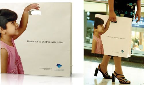
"Reach out to children with autism". This is a really clever example of ambient media. It's interactive and the message is very minimal and instantly clear. It's sharp witted and concise. Enough said.
Jean Pierre Jeunet is a weird and wonderful self-taught French director, whose creations include Amelie and a much earlier (1989) work called (roughly translated) "Things I Like Things I Don't Like". It's quite an odd little film, but Jeunet's individual style really shines through. His work is very energetic and quirky, and he always works with unusual looking actors. Jeunet mixes the tempo a lot, always keeping the viewer visually stimulated. I love that in Amelie, a character is always introduced by the things they love and hate, and it's clear that this earlier film was the foundation that led to these great quirks in his work.
This is another one of those books that you can dip into and find inspiration every time. I have the 2004 edition, but I've just seen that they've released a 2008 edition with more up to date campaigns. It's a really great book for getting you thinking about why an advert works and what the elements of a successful campain are. I bought it for about £30 a few years ago, but it's on Amazon for £15 at the moment - an absolute steal! Well worth it.
I was fortunate enough to go on the New York trip in March, and while there we visited the Museum of Modern Art (MOMA). I know a few others have posted about this museum, but there was so much to see that I think everyone had a totally different experience. You could literally spend days in the museum and still not see everything, so we fast tracked to the "50 Years of Helvetica" exhibition, the design and the pop-art section and the Lucian Freud exhibition. I have so many photos of all the great things I saw, so I'm going to have to restrain myself and post only a few highlights at random.
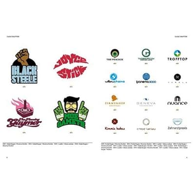
I was asked to design a couple of logos this summer and didn't quite know where to start, so I went out and found this book. It's a really good well presented resource and something that you could refer to endlessly. It is mainly a display of successful logos which are great for inspiration, but the book also features case studies with logo redesigns. The book is catagorised by industry sectors, such as fashion or sports, which is useful when browsing. All in all a nice shiny book with lots of nice shiny pictures. Perfect for us shiny designer folk!
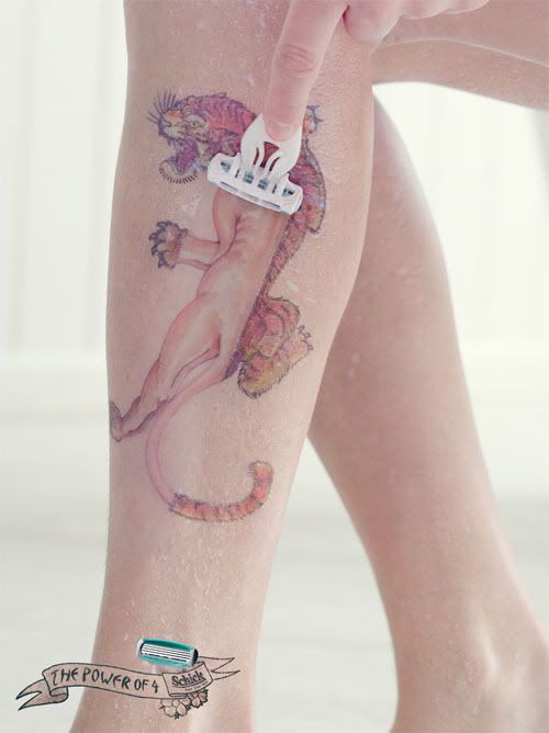
This is a brilliant example of how one image in advertising can summarise the whole message perfectly. Gone are the days when advertising was all about clever copywriting with long spiels of text about how fantastic the product is - nobody has time these days to stop and read copy, so advertising needs to sell the product at just a glance, and this ad does just that.
These images are from an exhibition by an artist called Jean Luc Cornec, who has used old telephones to create sheep-like forms. In essence he has achieved the same thing that surrealists such as Marcel Duchamp strived towards, in that he has taken an ordinary item and changed its meaning. Much like Duchamp's "the Fountain" (i,e, the urinal turned round to become a fountain), these are no longer telephones - they are sheep.This is also an interesting art form in such an environmentally concerned age since Cornec has created his art from entirely recycled materials. He has taken an apparently useless consumer item and given it a new purpose, thus encouraging others to shift their perspective of what an item is and discover what else a redundant product could potentially be used for.
The sheep can be seen at the The Museum für Kommunikation, which exhibits the history of communications equipment.
I came across the work of Man Ray while doing A Level Photography, and he has since remained one of my favourite photographers. He was in many ways a pioneer of photography, and was keen to experiment and push the boundaries of the media. He invented the process of solarisation (as seen in above photo, created by briefly exposing the image to natural light part way through the development process), and he also devised the image-making technique called photograms, which he called Rayograms. And as well as these achievements, Man Ray also created some great abstract photographs, such as those below.
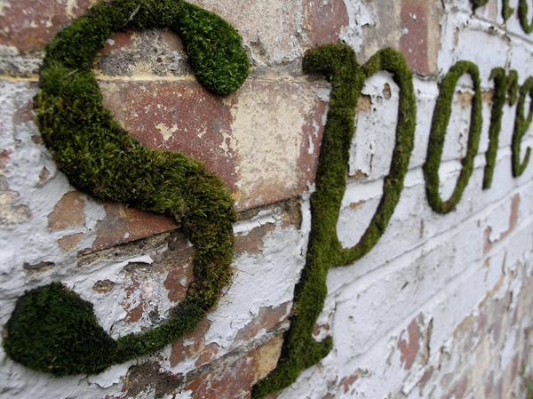
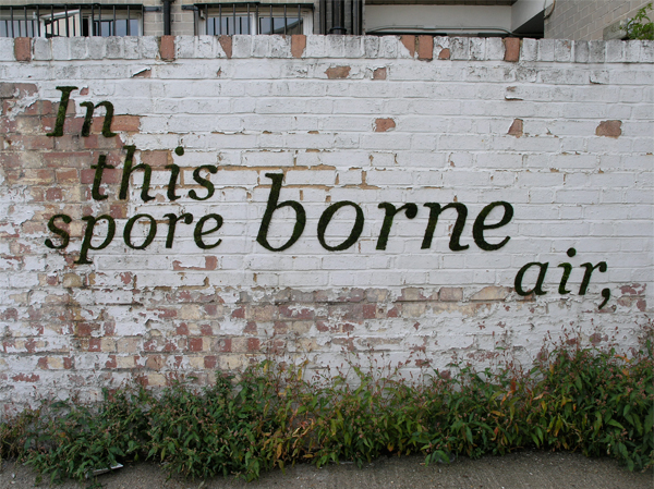
This is a project called "Mossenger" by an artist called Anna Garforth. The idea is to experiment with public space and street art by creating graffiti through natural materials - in this instance moss. It's certainly a greener alternative to spray paints, but would take a little more patience, and the moss would eventuallly expand to cover the whole wall. It would be interesting to know whether the authorities view this type of graffiti in the same way as spray painting. Would it still be illegal? While this is probably not the future of graffiti, it's certainly an interesting new take on it.
There's a company in Japan (Design Barcode) who started to have a bit of fun playing around with barcodes, and in doing so have created a big trend in Japan for barcode art. As they say, "Big ideas are small". It just goes to show that nothing about design should be overlooked, even something as seemingly mundane and functional as a barcode.
I've been looking everywhere for a photo of the Mini Cooper advert that I saw the other day, but just can't find one so you'll have to use your imagination! It's on the southern train line if you're going between Surrey and London, and it's a lifesize Mini Cooper which is about to be shot from a real catapult. It's a fantastic advert that can't have been cheap to execute, but it's perfect for both grabbing attention and conveying the message that Mini's are for having fun in.
Came across this guy who has taken a whole series of pretty impressive aerial photographs of London from a helicopter. What makes them more impressive is that for night photography you need a really long exposure, and it's difficult enough to steady a camera for long enough, let alone from a moving helicopter! He uses some kind of tripod with giros or something... In his words: (from Boston.com's 'The Big Picture')
"Shooting aerial photography during the daytime had its own difficulties, you are strapped tightly into a harness leaning out of the helicopter, shouting directions through the headsets to the pilot. If shooting in the day can be difficult, night and the lack of light causes its own set of problems, but overcoming them is half the fun and the results can be stunning. I shoot at night using the very latest digital cameras, mounted on either one or two gyro stablazied mounts, depending on the format of the camera and length of lens I'm having to use."
So I was reading Bella's blog about Laura Marling's Ghosts video, which reminded me about the 'songbox' which she released with her album Alas I Cannot Swim. Instead of sending the album out in just the usual case with a bit of imagery in the sleeve, Laura created a box full of postcards each representing a different song. It's a really nice tactile approach which you can go back to time and time again. It's also been integrated nicely into Laura Marling's website by allowing you to click on a postcard to listen to the relevant song. The box also included a free gig ticket, which is a really good incentive for people to buy the album instead of just downloading it.
I found this design company which do some really interesting illustrations and photographs displayed in a well presented website. However, despite looking nice, the website was really annoying to use because the user has to expand the browser to see the whole image, and on low resolution screens it is an absolute pain as there is no scroll bar. The becomes really wide when you look at the images, and as you can not scroll, half the picture is lost. Very irritating, but they do have some nice work. See more at vault49.com
I'd heard about the Sagrada Familia in Barcelona, but had no idea just how amazing it is until I started doing some proper research on it (on Wikipedia, of course!). The construction was designed by Antoni Gaudi, and the build started in 1882. It is not, however, expected to be finished until 2026. This is in part due to the amazingly intricate details in every aspect of the church, including the 18 towers and three grand facades, not to mention the interior.
If you ever find yourself stuck for colour inspirations, or are struggling to find the right colour combination, there's a great resource I found called Colour Lovers (http://www.colourlovers.com/) which describes itself as a "Color + Design Community for Creative Inspiration". It's full of harmonising colour palettes and some great patterns posted by members, such as "Chocolat Jazzberries" and "Candy Apple Reds" below. It's also a reminder of just how many millions of colour combinations there are, and how mammoth our task is, as the designer, to get it right every time!