 I was asked to design a couple of logos this summer and didn't quite know where to start, so I went out and found this book. It's a really good well presented resource and something that you could refer to endlessly. It is mainly a display of successful logos which are great for inspiration, but the book also features case studies with logo redesigns. The book is catagorised by industry sectors, such as fashion or sports, which is useful when browsing. All in all a nice shiny book with lots of nice shiny pictures. Perfect for us shiny designer folk!
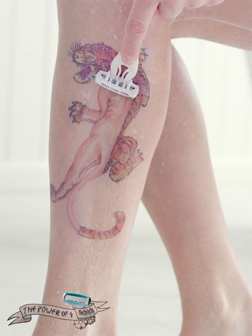 This is a brilliant example of how one image in advertising can summarise the whole message perfectly. Gone are the days when advertising was all about clever copywriting with long spiels of text about how fantastic the product is - nobody has time these days to stop and read copy, so advertising needs to sell the product at just a glance, and this ad does just that.
 These images are from an exhibition by an artist called Jean Luc Cornec, who has used old telephones to create sheep-like forms. In essence he has achieved the same thing that surrealists such as Marcel Duchamp strived towards, in that he has taken an ordinary item and changed its meaning. Much like Duchamp's "the Fountain" (i,e, the urinal turned round to become a fountain), these are no longer telephones - they are sheep. This is also an interesting art form in such an environmentally concerned age since Cornec has created his art from entirely recycled materials. He has taken an apparently useless consumer item and given it a new purpose, thus encouraging others to shift their perspective of what an item is and discover what else a redundant product could potentially be used for.
The sheep can be seen at the The Museum für Kommunikation, which exhibits the history of communications equipment. 
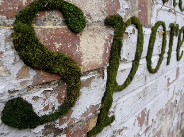
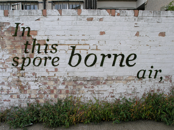 This is a project called "Mossenger" by an artist called Anna Garforth. The idea is to experiment with public space and street art by creating graffiti through natural materials - in this instance moss. It's certainly a greener alternative to spray paints, but would take a little more patience, and the moss would eventuallly expand to cover the whole wall. It would be interesting to know whether the authorities view this type of graffiti in the same way as spray painting. Would it still be illegal? While this is probably not the future of graffiti, it's certainly an interesting new take on it.

There's a company in Japan (Design Barcode) who started to have a bit of fun playing around with barcodes, and in doing so have created a big trend in Japan for barcode art. As they say, "Big ideas are small". It just goes to show that nothing about design should be overlooked, even something as seemingly mundane and functional as a barcode.

I've been looking everywhere for a photo of the Mini Cooper advert that I saw the other day, but just can't find one so you'll have to use your imagination! It's on the southern train line if you're going between Surrey and London, and it's a lifesize Mini Cooper which is about to be shot from a real catapult. It's a fantastic advert that can't have been cheap to execute, but it's perfect for both grabbing attention and conveying the message that Mini's are for having fun in.
 Came across this guy who has taken a whole series of pretty impressive aerial photographs of London from a helicopter. What makes them more impressive is that for night photography you need a really long exposure, and it's difficult enough to steady a camera for long enough, let alone from a moving helicopter! He uses some kind of tripod with giros or something... In his words: (from Boston.com's 'The Big Picture')
"Shooting aerial photography during the daytime had its own difficulties, you are strapped tightly into a harness leaning out of the helicopter, shouting directions through the headsets to the pilot. If shooting in the day can be difficult, night and the lack of light causes its own set of problems, but overcoming them is half the fun and the results can be stunning. I shoot at night using the very latest digital cameras, mounted on either one or two gyro stablazied mounts, depending on the format of the camera and length of lens I'm having to use."

Saw this a while ago and I love it - best with the sound on: Animator vs Animation

So I was reading Bella's blog about Laura Marling's Ghosts video, which reminded me about the 'songbox' which she released with her album Alas I Cannot Swim. Instead of sending the album out in just the usual case with a bit of imagery in the sleeve, Laura created a box full of postcards each representing a different song. It's a really nice tactile approach which you can go back to time and time again. It's also been integrated nicely into Laura Marling's website by allowing you to click on a postcard to listen to the relevant song. The box also included a free gig ticket, which is a really good incentive for people to buy the album instead of just downloading it.

Somebody sent me a link for this great website, that turns online shopping on its head, literally.
Not really sure what they actually do because it's not English, but have a look at producten.hema.nl

 I found this design company which do some really interesting illustrations and photographs displayed in a well presented website. However, despite looking nice, the website was really annoying to use because the user has to expand the browser to see the whole image, and on low resolution screens it is an absolute pain as there is no scroll bar. The becomes really wide when you look at the images, and as you can not scroll, half the picture is lost. Very irritating, but they do have some nice work. See more at vault49.com

I'd heard about the Sagrada Familia in Barcelona, but had no idea just how amazing it is until I started doing some proper research on it (on Wikipedia, of course!). The construction was designed by Antoni Gaudi, and the build started in 1882. It is not, however, expected to be finished until 2026. This is in part due to the amazingly intricate details in every aspect of the church, including the 18 towers and three grand facades, not to mention the interior. 
If you ever find yourself stuck for colour inspirations, or are struggling to find the right colour combination, there's a great resource I found called Colour Lovers (http://www.colourlovers.com/) which describes itself as a "Color + Design Community for Creative Inspiration". It's full of harmonising colour palettes and some great patterns posted by members, such as "Chocolat Jazzberries" and "Candy Apple Reds" below. It's also a reminder of just how many millions of colour combinations there are, and how mammoth our task is, as the designer, to get it right every time!
 Chocolate Jazzberries
 Candy Apple Reds
This blog post was going to be the Glaswegian student James Houston's remix of Radiohead's track 'Nude'. However, Paddy beat me to it on the Glog, so instead I'm posting Radiohead's new video for House of Cards by Google Creative. It is totally revolutionary since it uses no cameras or lighting, just 3D data plotting. I'm not going to lie, I don't really know what that is, but the video looks pretty cool! If you are interested the technicalities, there's a short documentry called "The Making of House of Cards Video" The quality's not so great in this YouTube copy, so I'd recommend visiting Google Creative's post to see the video at a higher resolution.
 Most of you have probably come across the work of Nick Brandt before but if you haven't, he is an absolutely amazing wildlife photographer whose work is definitely worth taking a look at. It's not just his compositions I love, it's the treatment of them. I did A Level photography and we didn't touch a single digital camera in the whole two years. Instead of Photoshop, we used the darkroom extensively to manipulate and enhance our shots with manual techniques such as bleaching and sepia treatment. And, at the risk of sounding old, I think this is something that is really lost in the digital age. It's pretty easy to create great effects in Photoshop, but they're just not as good as the real deal, and I think this is something that is being reflected in design at the moment - particularly within illustration I've seen a lot of artists revert back to good old fashioned paper and ink over vector images. Computers are a fantastic tool, but I personally think we shouldn't loose touch with the tactile approach.
I'm also very jealous of anyone who makes a living by spending their time sitting around in Africa taking photos! I'm lucky enough to have been to Ambolseli where a lot of Nick Brandt's shots were taken, and this is my best attempt:
 It's not to bad a shot, but it's nowhere near the standard of Brandt's photos. To see more of his work and other great photographers, visit the Young Gallery.

 Don't Click It is a really inspirational concept site, which endeavours to make people think differently about a graphical interface that we are all too familiar with: the mouse. The site encourages visitors to experiment with a new interface, which involves using the mouse to navigate without ever needing to click. All your movements within the site are recorded, allowing for the authors to analyse the success of the project and assess how easy it is for us to break the habit of clicking. Don't Click It asks each visitor whether they miss the click, and they report that 932469 don't miss it, while only 534224 would rather keep clicking.
 I stumbled upon this website for a group of French designers called Creaktif. I really liked the imagery used and the interactivity of the site, both of which I feel give a good idea of the designers' personalities. It is also an easy to navigate site, which I think is often missing on creative Flash websites like this (especially ones where you can't use the back button).
As well as a good interface and design, Creaktif also have some interesting work, such as these two experimental images:


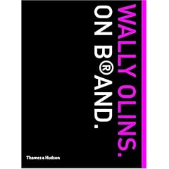
I was reading Caroline King's post about David A. Aaker's book Building Strong Brands with interest as I also read this for dissertation research. While I agree that it is an insightful read, I personally preferred Wally Olins take on the branding world in his book On Brand. I found that On Brand was written in more direct language than Building Strong Brands, making it easier to follow. It is also less, well, American! Olins gets straight to the point which I like, and the case studies are a lot more familiar to us Brits, such as Unilever and Volkswagen instead of Saturn cars (who I hadn't even heard of). £8.42 on Amazon with a well earned 5* rating.
 I went to see an Alexander Rodchenko exhibition at the Southbank Centre in London a couple of months ago and had a look on the way out at an exhibition called Laughing in a Foreign Language. The exhibition featured many types of comedy from different cultures as a way of testing whether comedy is subjective according to cultural backgrounds. It was a really interesting exhibition, but not at all funny. As the exhibition summary says:
"Laughing in a Foreign Language explores the role of laughter and humour in contemporary art. In a time of increasing globalisation, this international exhibition questions if humour can only be appreciated by people with similar cultural, political or historical backgrounds and memories, or whether laughter can act as a catalyst for understanding what you are not familiar with."


